Project Info
Client:
Bayer
Bayer
Role:
UI/UX Designer
UI/UX Designer
Over a four-year span, we were tasked to redesign MyHR, transforming it from a fragmented intranet space into a central hub for Employees and People Leaders to manage their daily HR needs. The goal was to provide a clear, intuitive system that not only streamlined routine tasks like timesheets, payslips, and goal setting, but also gave visibility into the organisation’s annual HR calendar—including performance milestones, check-ins, and rewards such as bonuses and merit increases.
The revamp was rolled out in progressive layers. We began with an HR calendar, first version as a quick fix, version 2A and then 2B with a tailored design approach and user-specific data. The project followed an agile approach, with regular stand-ups, stakeholder check-ins, and close collaboration with developers to ensure continuous alignment and delivery. In the early stages, we conducted workshops with employees and people leaders to surface major pain points and build a clear wishlist of desired features for MyHR. These insights shaped the design strategy and ensured the platform addressed both everyday usability needs and long-term HR processes.
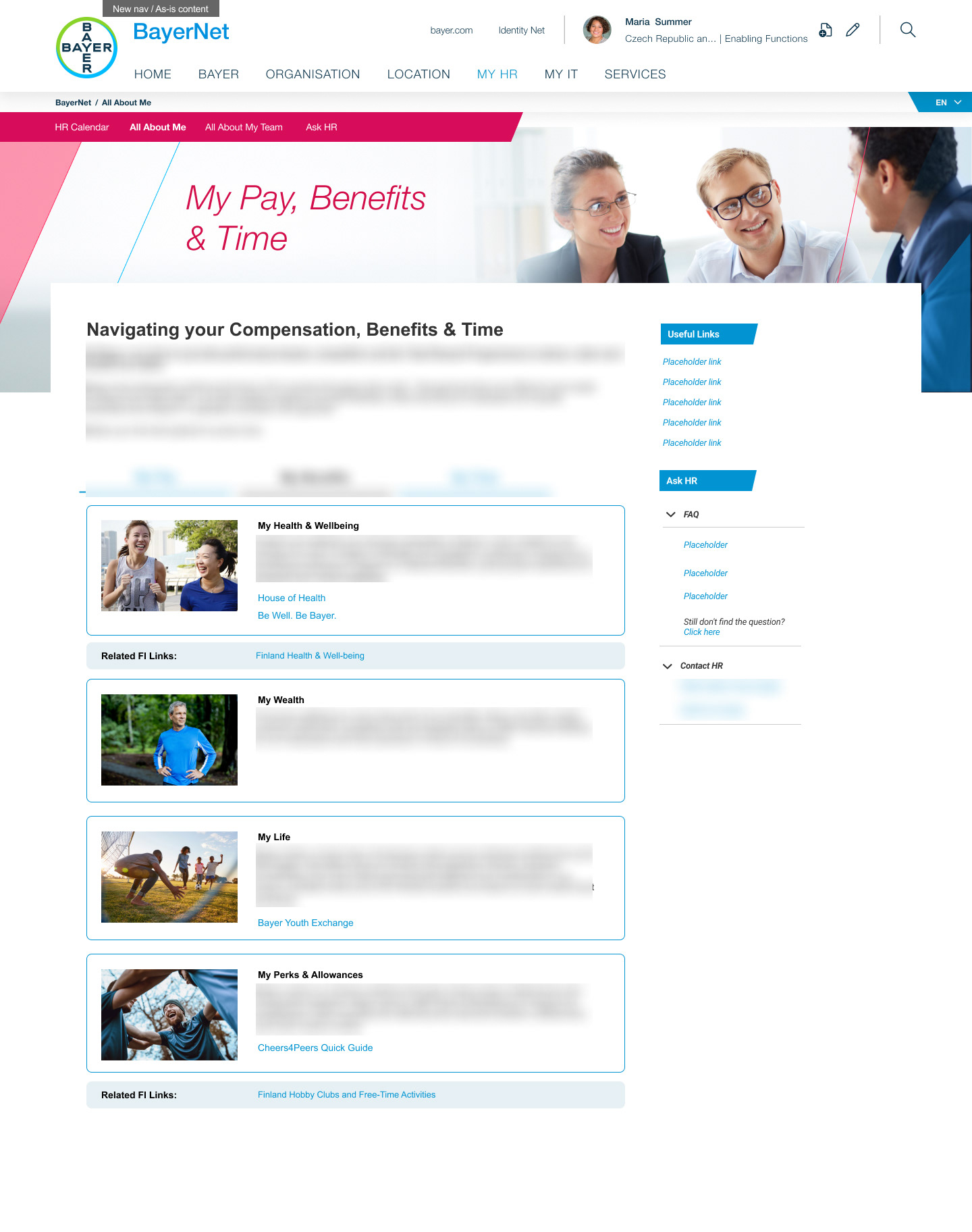
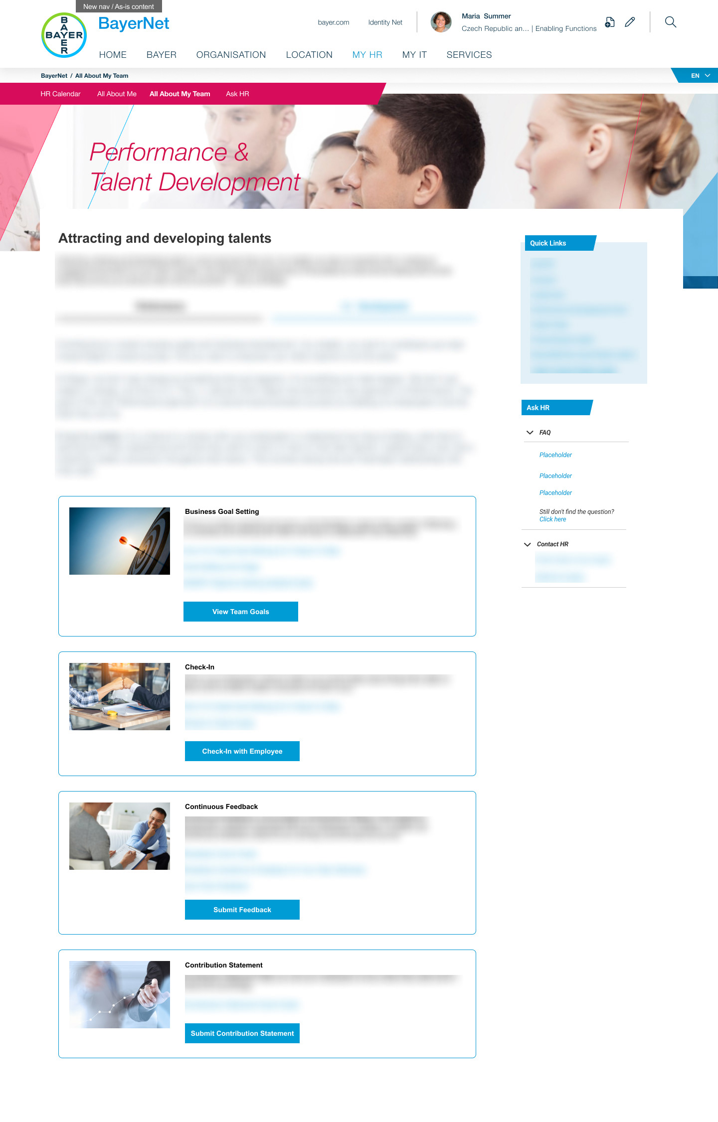
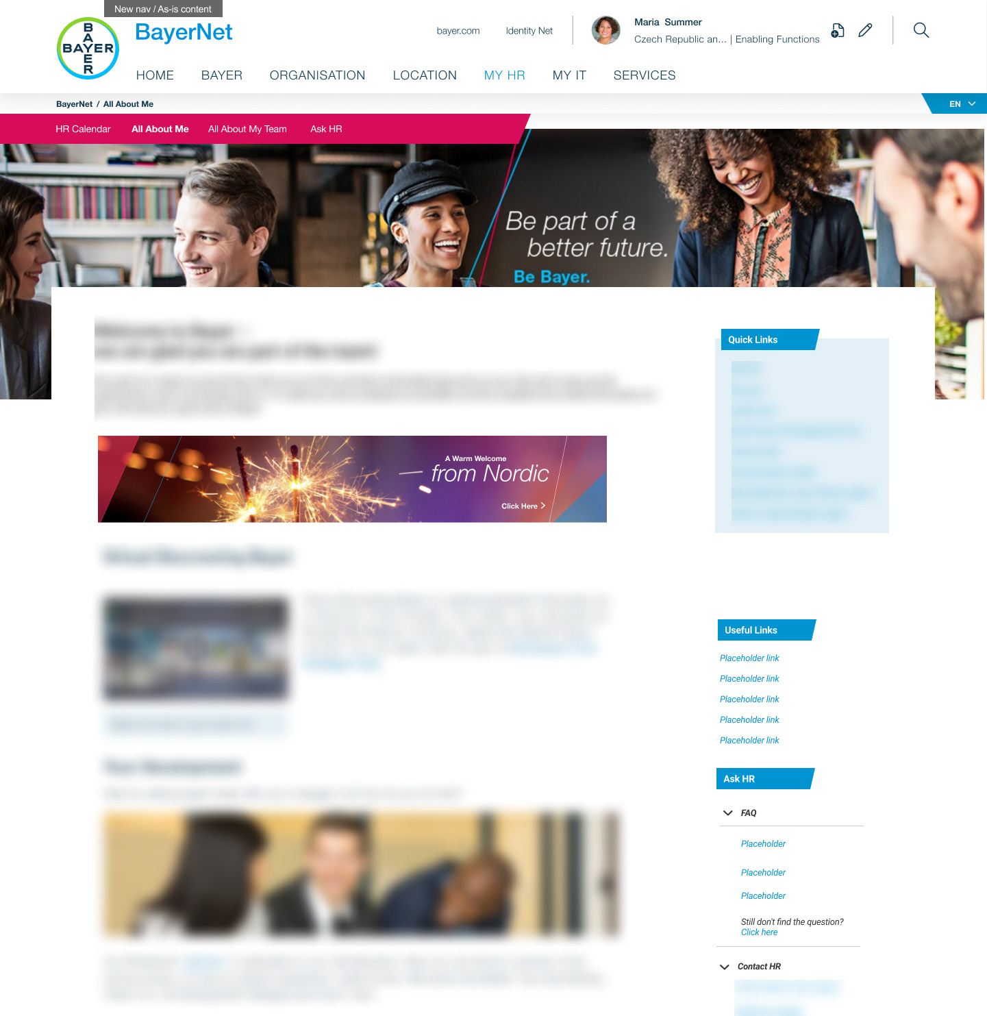
Across all versions, the design consistently separated perspectives into “All About Me” (employee self-services) and “All About My Team” (leader-focused tasks), giving People Leaders the ability to toggle seamlessly between personal and team views. This layered approach not only improved daily usability but also laid the foundation for a secure, data-driven, and future-ready HR experience within Bayer’s intranet.
Note: Due to the sensitive nature of this project, certain data and details have been omitted from the mock-ups. While Bayer is no longer my client, I also do not have visibility into how much of the final design was ultimately implemented.
HR Calendar
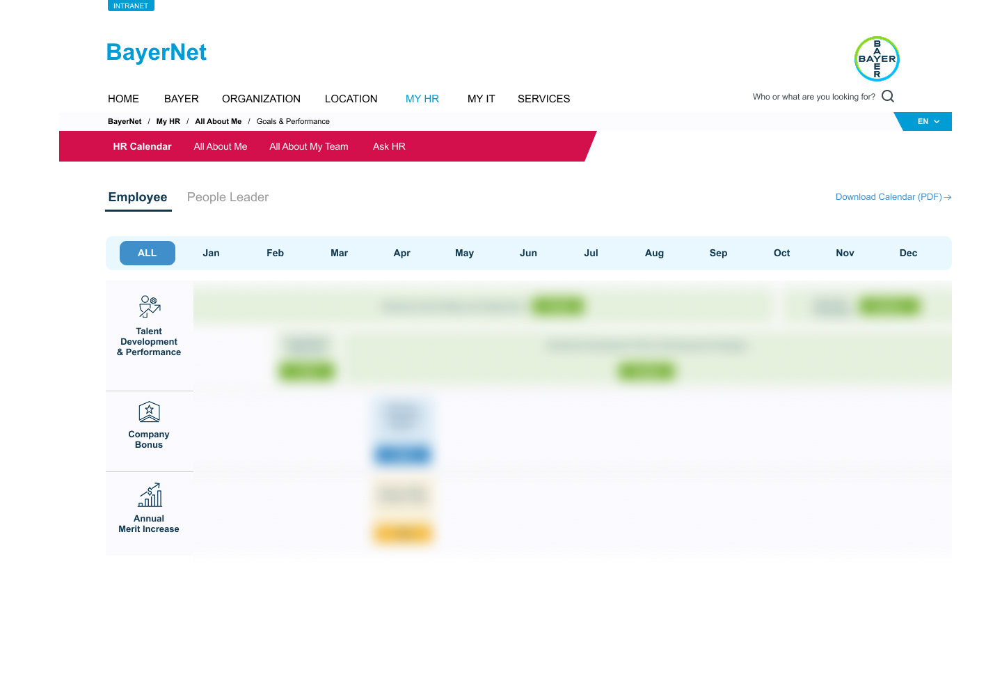
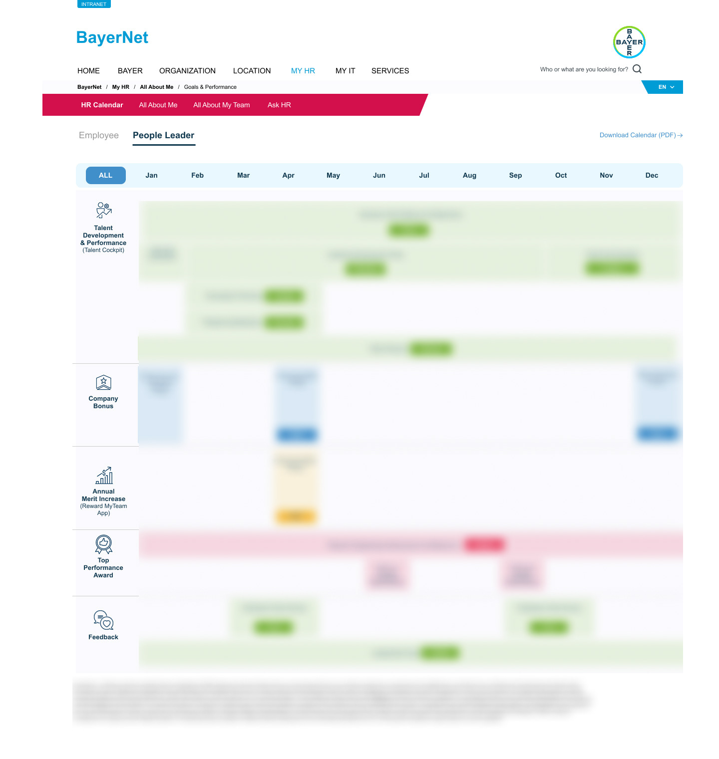
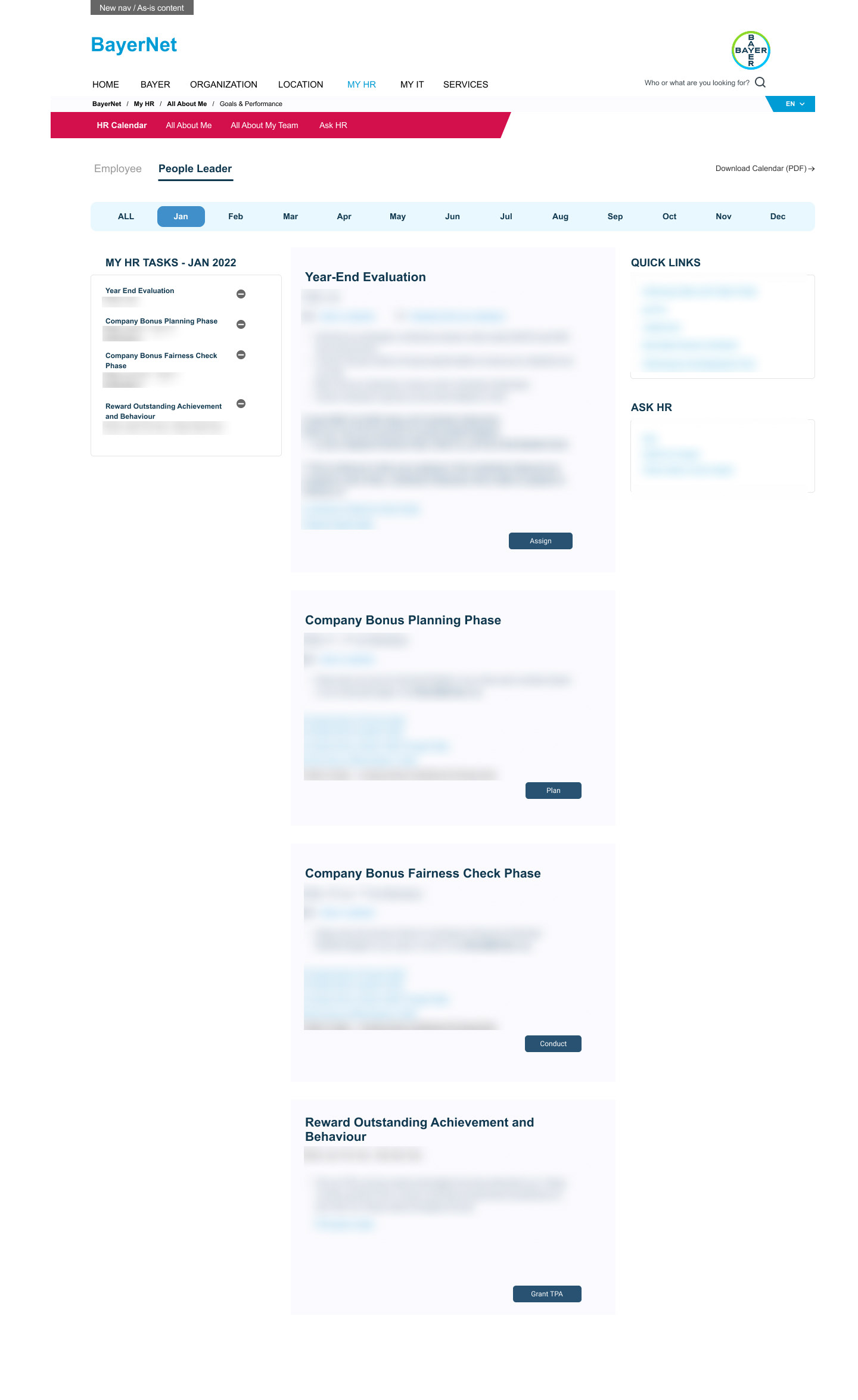
The HR Calendar was designed as a one-stop shop for all HR needs, giving employees and people leaders a clear, structured view of key milestones across the year. At the yearly level, users can see important HR events and deliverables at a glance, while the monthly view provides more detailed guidance, with each call-to-action linking directly to the external systems or tools needed to complete tasks such as goal setting, performance check-ins, or payroll-related actions.
The calendar is dynamic and country-specific, changing in line with the organisation’s discretion—meaning no two country calendars are exactly alike. To further support usability, it offers two perspectives: Employees and People Leaders. While both share overarching milestones, each view highlights the most relevant tasks, whether it’s employees scheduling check-ins with their leaders or leaders facilitating team development activities. Though sensitive details have been omitted, the original design shows that milestones are clearly dated and supported direct quick links to book time with managers, making it a practical and action-oriented tool within Bayer’s intranet.
Version 1
The initial phase of the redesign focused on providing the fastest and most practical fix to address users’ biggest pain point: difficulty navigating the intranet to complete routine HR tasks. We introduced modular quick link boxes that were fully searchable, allowing employees to easily find what they needed—whether submitting timesheets, accessing payslips, or completing other HR actions. Each module was designed to be clear and straightforward, containing a title, image, concise information (omitted here), and a direct call-to-action.
To balance Bayer’s global–local needs, global quick links were housed in standardised modules, while country-specific links were hard-coded as separate boxes under different categories. Additional navigation support, such as quick links and useful links in the right panel, ensured easier movement across topics and pages. An integrated AskHR panel gave employees access to FAQ articles and self-service help.
The main challenge at this stage was the complexity of managing multinational requirements—different countries required unique link permutations and layouts. For countries with a large volume of links, this demanded significant brainstorming around usability and hierarchy. Close coordination with country stakeholders was also crucial, as they had to determine which links should be surfaced prominently. To accommodate varying priorities, we also included banner placements for countries to highlight specific calls-to-action more prominently than the standard quick links.
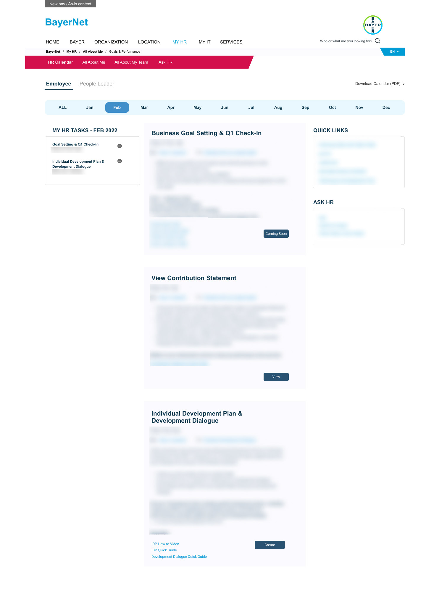
Version 2A - Workflow Redesign
The second phase moved beyond quick fixes and introduced a complete redesign of the HR pages. Instead of modular quick link boxes, we implemented a workflow component with a stepper-style UI, guiding users through HR milestones in a structured and intuitive way. The information layout mirrored the monthly detail view of the HR Calendar, with clearly dated milestones, concise descriptions, and direct calls-to-action that linked to the same external systems and tools as before.
This version emphasised clarity and consistency. Each page included additional resources—such as files, guides, and videos—at the bottom, presented in modular form for easy access. The familiar quick links, useful links, and AskHR panel remained on the right for continuity, with the addition of a new TellHR feature to collect feedback, support user testing, and capture bugs. Although user-specific data was not yet integrated, the design moved away from a text-heavy, article-like format to a more step-driven experience, clearly showing users what to expect next and visually indicating whether certain milestones were upcoming, active, or already completed.
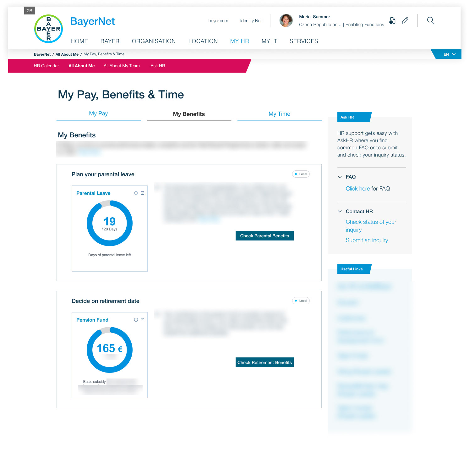
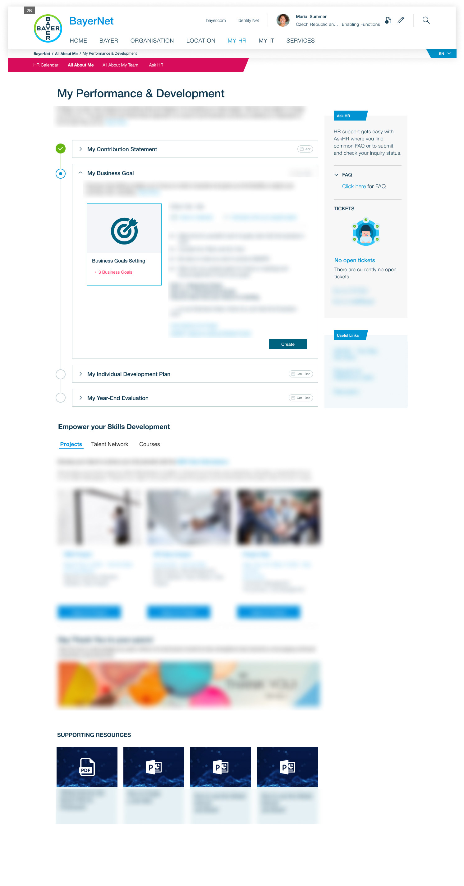
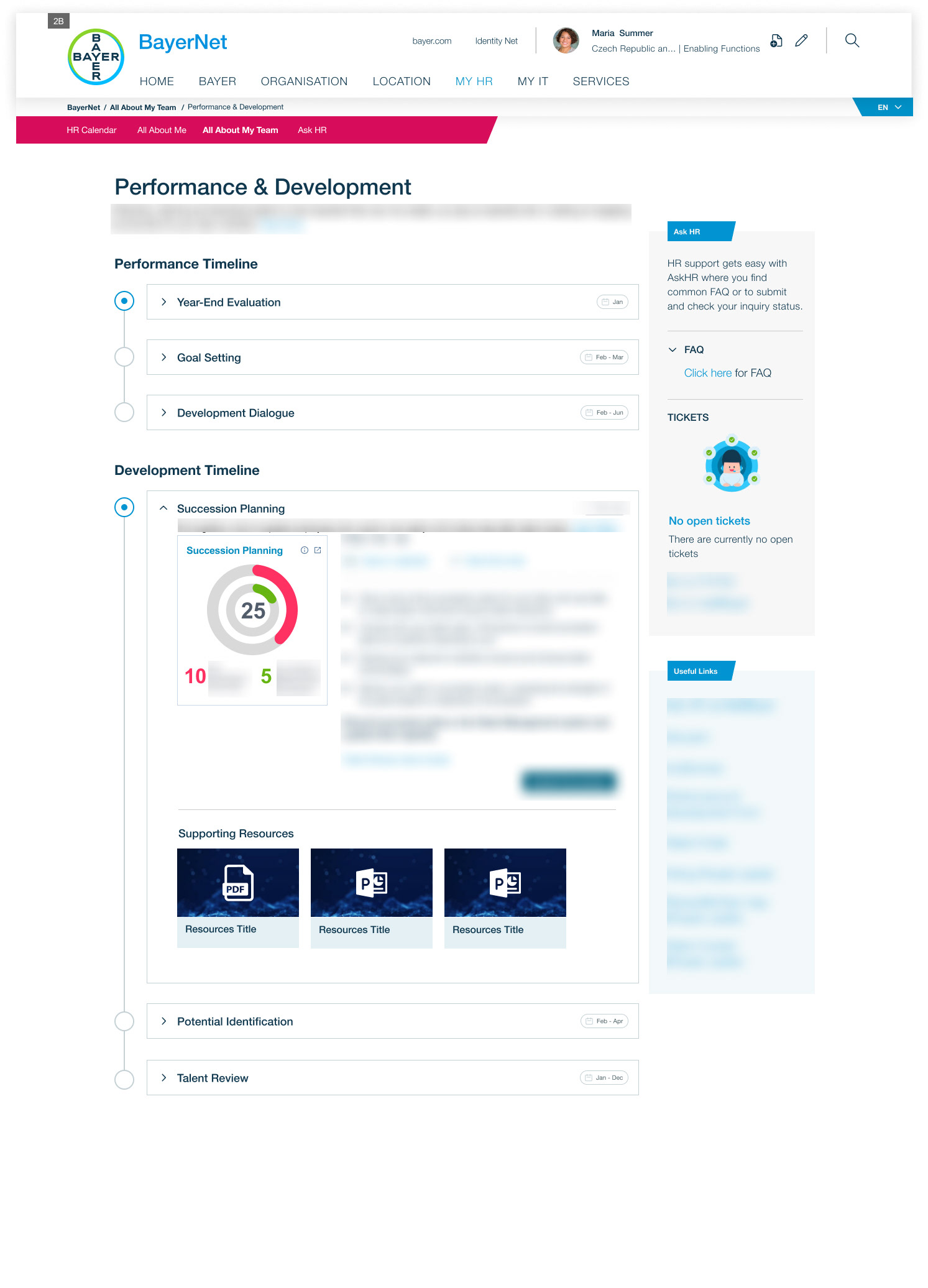
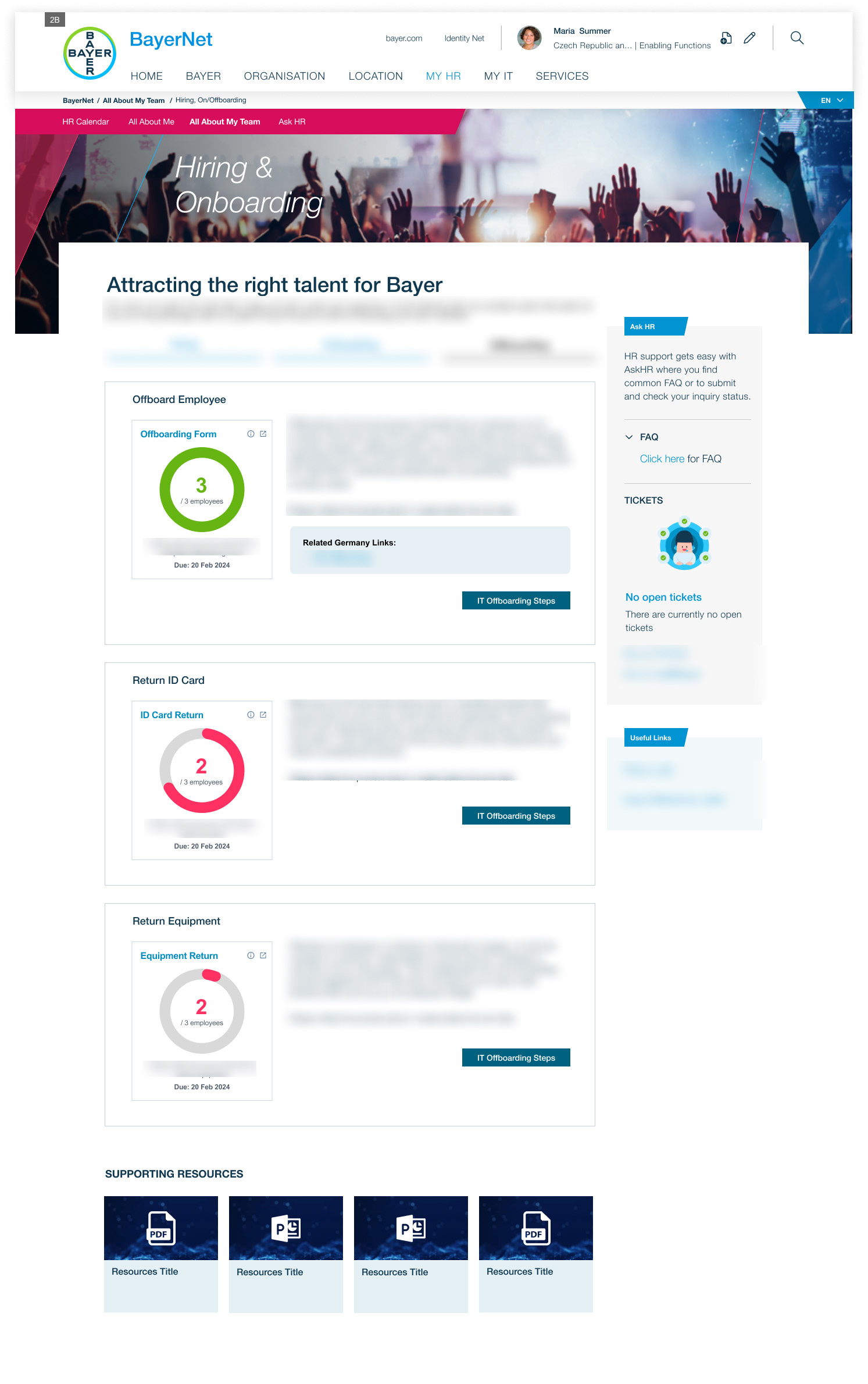
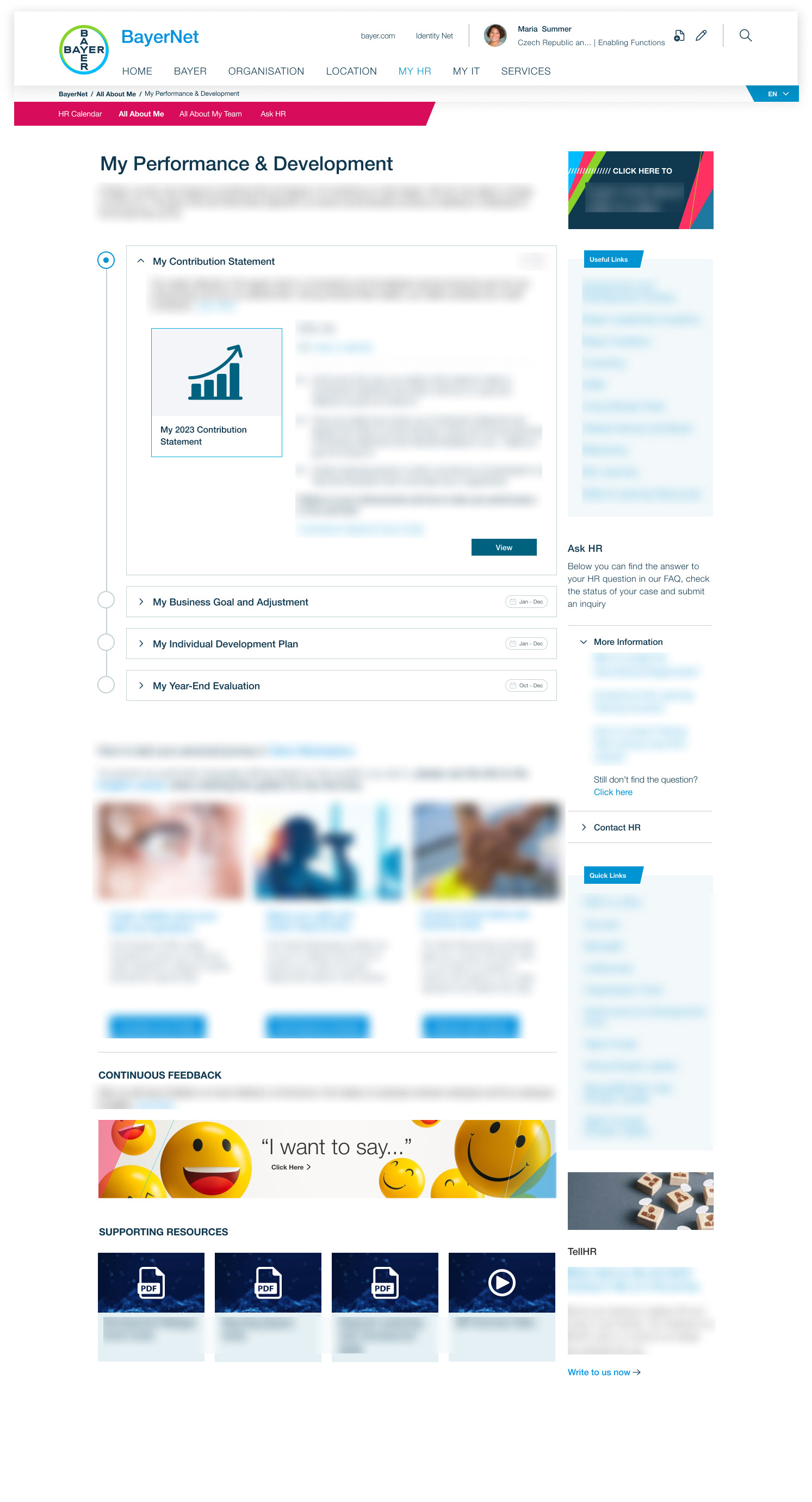
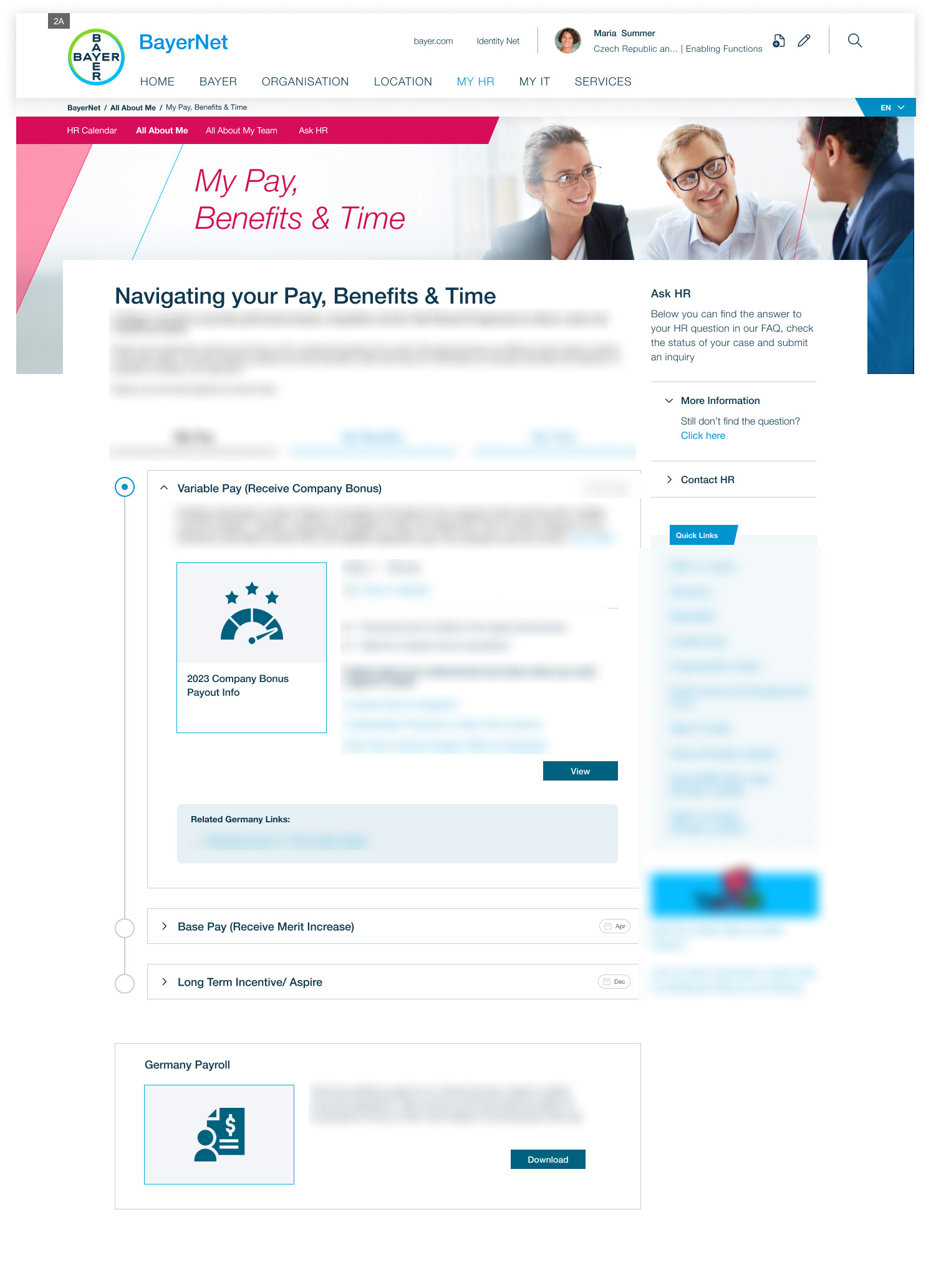
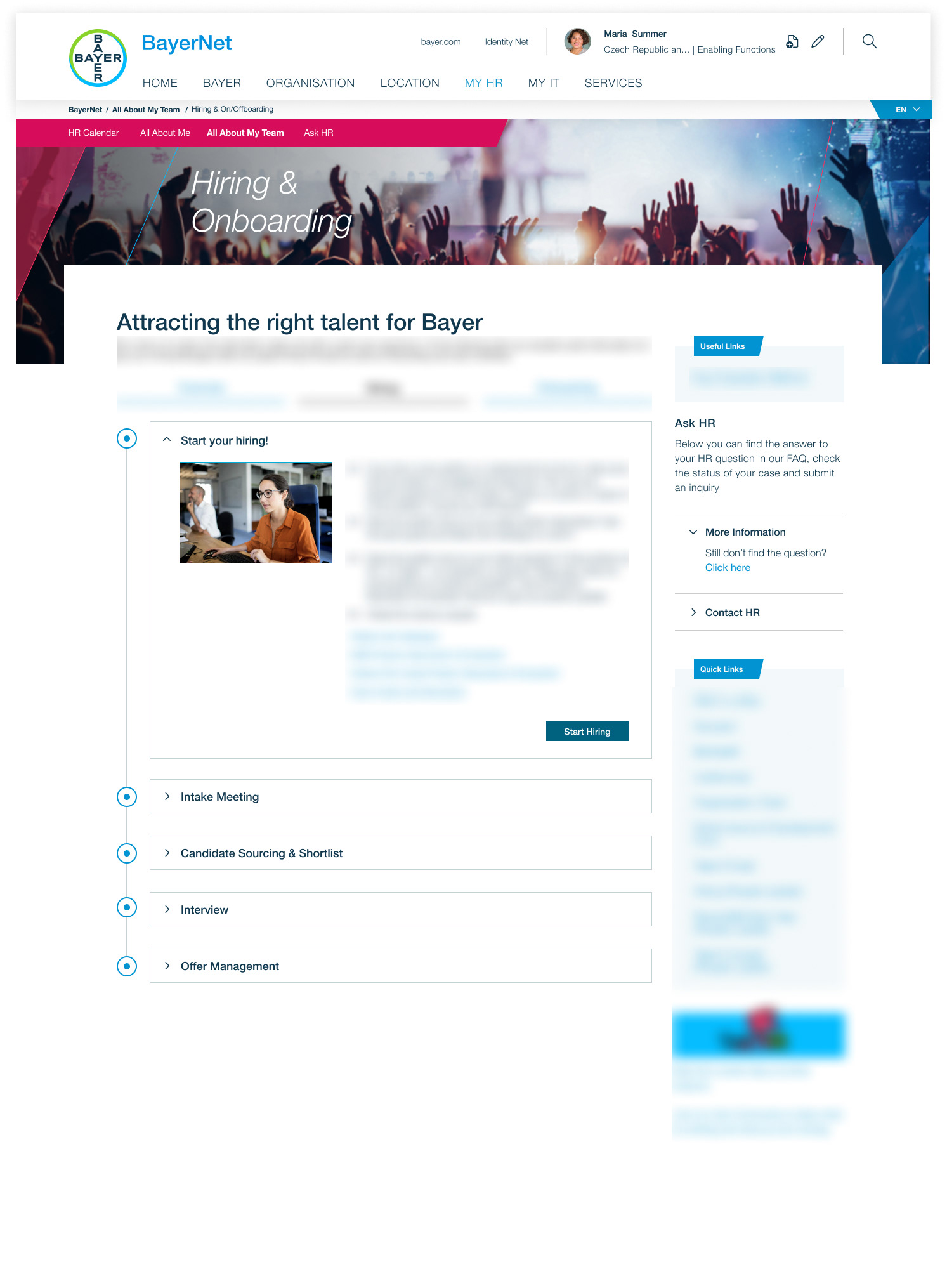
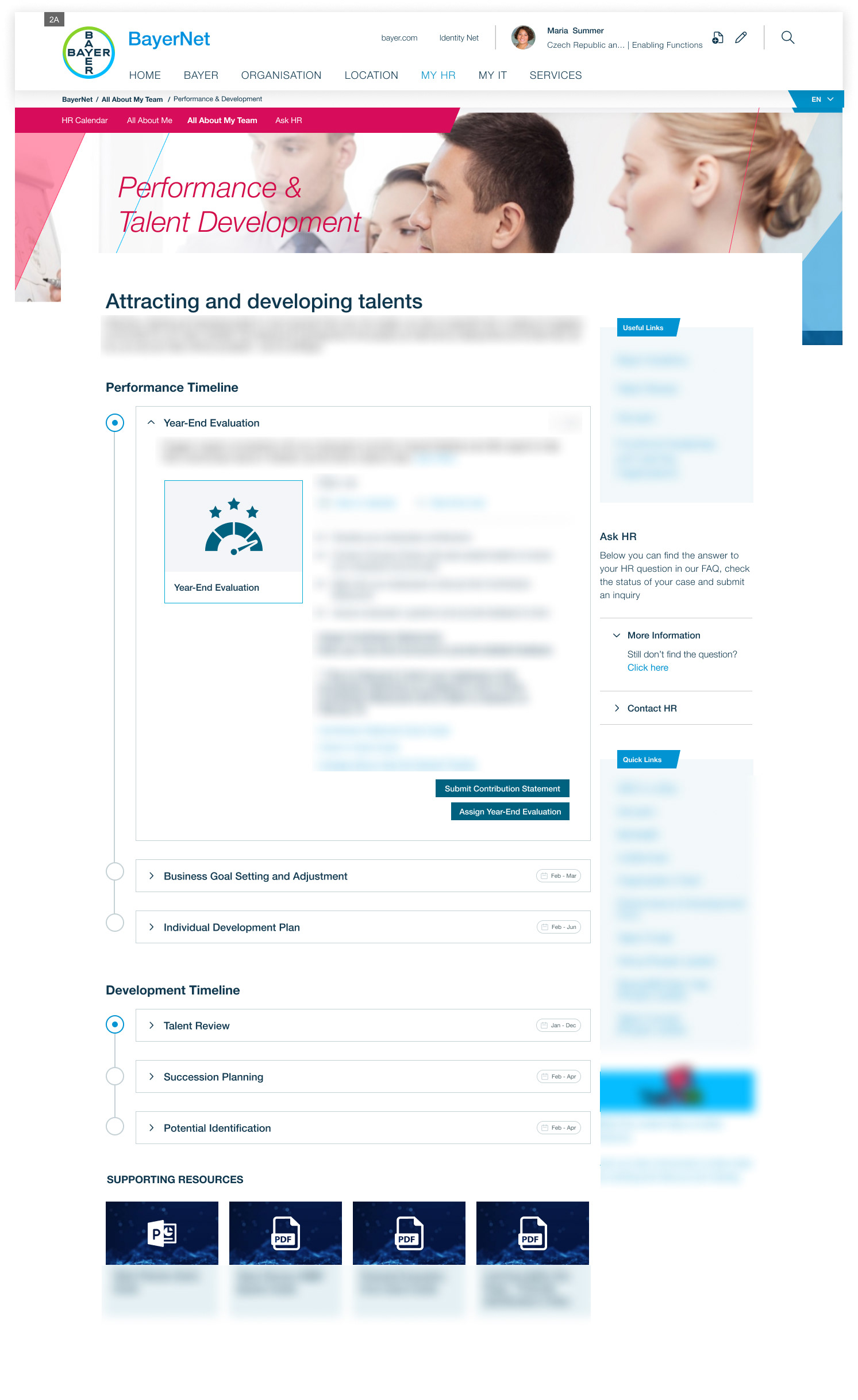
Version 2B - Personalised and Data Driven
Version 2B was built on the same workflow/stepper UI framework established in 2A, but advanced it with personalised, user-specific data. While the information layout and call-to-action buttons remained consistent, each module now included a data panel (previously just a graphic and title) tailored to the individual employee or people leader. This allowed for dynamic views—such as performance metrics, pay and benefits, or team hiring status—presented in formats like pie charts, graphs, or wheels. Importantly, while employees and people leaders both accessed data-driven views, leader-specific components were restricted to ensure appropriate visibility, with only generic placeholders shown to employees.
Supporting resources also became more contextual, embedded at the milestone level rather than only at the bottom of pages. Country-specific links continued to be displayed in their own boxes, maintaining global usability while meeting local needs. The overall goal was not to replace Bayer’s many external tools but to act as a bridge, helping users quickly find and access what they needed without the stress of navigating multiple systems—critical given the time-sensitive nature of HR tasks and milestones.
The biggest challenges in this phase were technical implementation and security—ensuring data was restricted to the intended user only—and addressing user skepticism around sensitive data handling. In addition, compliance with local regulations, such as Germany’s Workers’ Council requirements, was essential to ensure transparency and trust.