Project Info
Client:
Pearson Education
Pearson Education
Timeline:
Mar - Jun 2023
Mar - Jun 2023
Role:
UI/UX Designer
UI/UX Designer
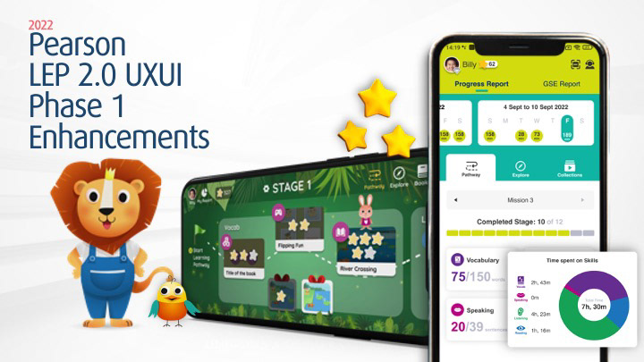
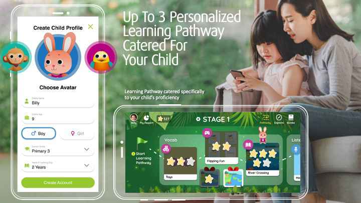
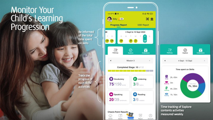
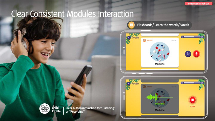
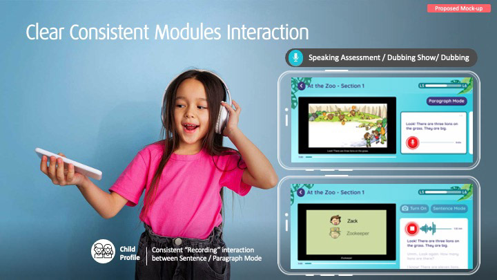
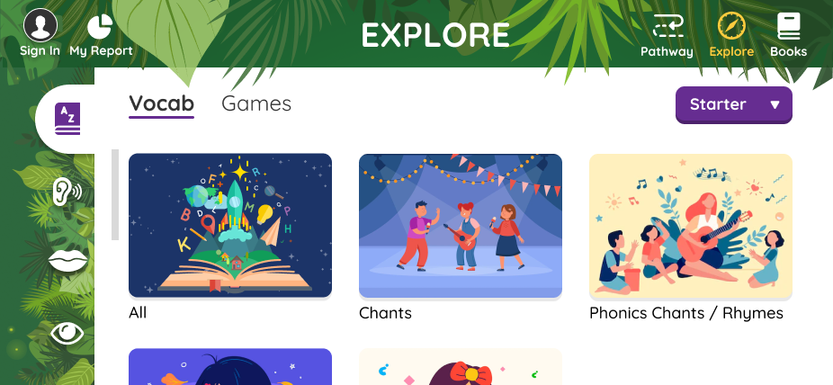
Pearson LEP 2.0 is an AI-driven digital learning platform designed to personalise English language learning experiences for children. In this project, we redesigned and enhanced key user flows for both learners and parents. Our work focused on improving the learning pathway experience, making child progress tracking more intuitive, and creating consistent module interactions for activities like speaking, listening, and vocabulary learning.
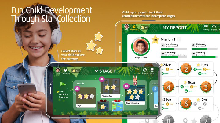
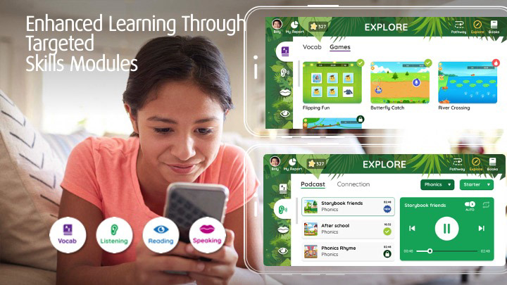
We introduced personalised pathways, gamified star collection for engagement, and a data-rich reporting system to support parents in monitoring their child's development. The updated interface also provided clearer visual cues and more accessible interactions across sentence and paragraph-level tasks, supporting a more seamless learning journey.
Key Challenges
Balancing Dual User Journeys
Designing distinct yet interconnected user flows for both students and parents was a key challenge. Each group required tailored login experiences, dashboards, and content interactions, necessitating a thoughtful architecture that met their unique needs while ensuring overall platform cohesion.
Designing distinct yet interconnected user flows for both students and parents was a key challenge. Each group required tailored login experiences, dashboards, and content interactions, necessitating a thoughtful architecture that met their unique needs while ensuring overall platform cohesion.
Designing Within Fixed Content Constraints
One of the limitations was the inability to alter existing question content. The focus was on enhancing the user experience through improved layout, interaction design, and visual clarity—particularly for younger learners—without changing the pedagogical structure.
One of the limitations was the inability to alter existing question content. The focus was on enhancing the user experience through improved layout, interaction design, and visual clarity—particularly for younger learners—without changing the pedagogical structure.
Avoiding Overlap with Competitor Apps
It was important to craft a unique, brand-aligned user experience without unintentionally mimicking popular competitor platforms. This required a more nuanced approach to UI inspiration, ensuring the design felt fresh, credible, and distinctly Pearson.
It was important to craft a unique, brand-aligned user experience without unintentionally mimicking popular competitor platforms. This required a more nuanced approach to UI inspiration, ensuring the design felt fresh, credible, and distinctly Pearson.
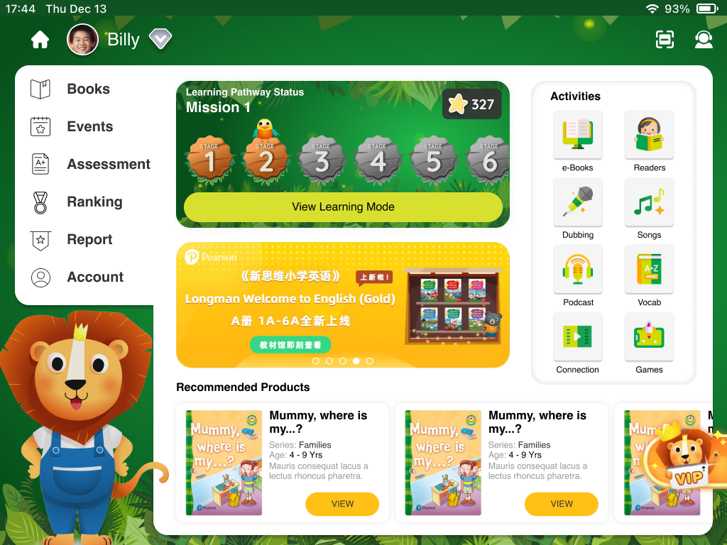
Homepage - iPad
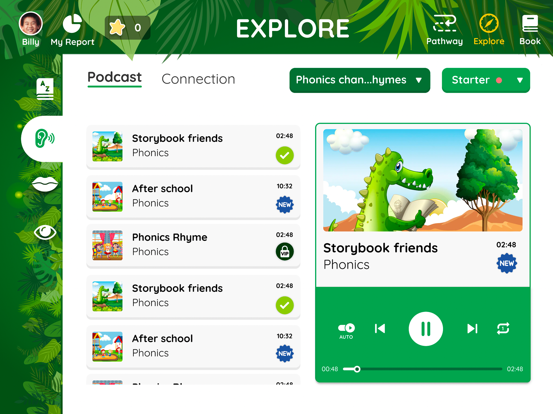
Podcast Page - iPad
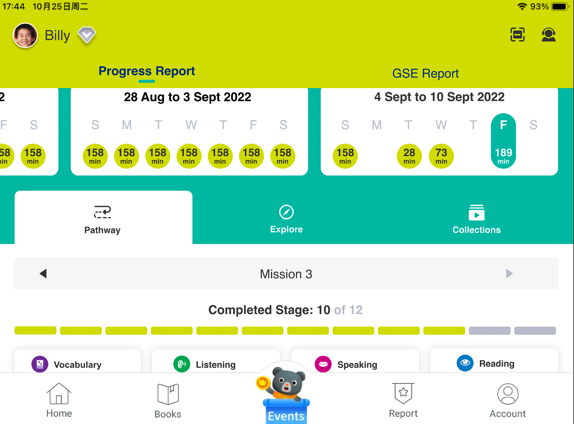
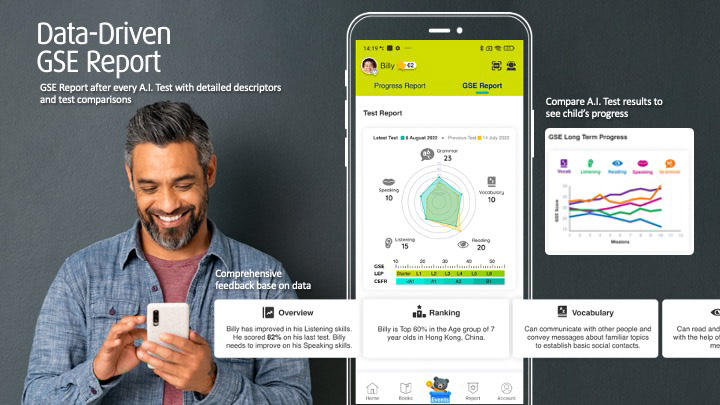
Parents' Report - iPad

Landing - Mobile

Loading Transition Page - Mobile

Learning Pathway - Mobile
Vocab - Mobile
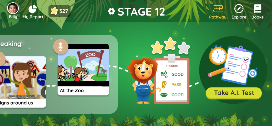
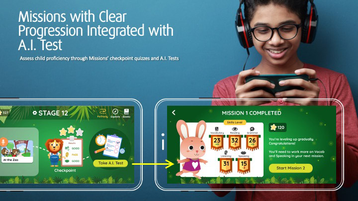
Learning Pathway AI Test - Mobile
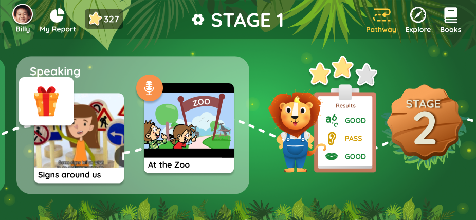
Learning Pathway Stages - Mobile
What Went Well & Personal Learnings
Positive User Reception
The redesigned experience was well-received by both parents and students, particularly among user groups in China, validating the usability and accessibility improvements made during Phase 1.
The redesigned experience was well-received by both parents and students, particularly among user groups in China, validating the usability and accessibility improvements made during Phase 1.
Improved Engagement Metrics
Post-launch analytics showed a notable increase in overall app usage and a rise in paid user conversions, indicating that the design enhancements contributed to higher user retention and value perception.
Post-launch analytics showed a notable increase in overall app usage and a rise in paid user conversions, indicating that the design enhancements contributed to higher user retention and value perception.
Client Continuity & Trust
Following the success of this phase, Pearson extended our collaboration to lead the UX/UI revamp of their Hong Kong-based Pearson English Connect platform, expanding our design impact to include teacher-focused workflows.
Following the success of this phase, Pearson extended our collaboration to lead the UX/UI revamp of their Hong Kong-based Pearson English Connect platform, expanding our design impact to include teacher-focused workflows.
Expanded Domain Expertise
This project deepened my understanding of designing educational experiences across multiple personas—children, parents, and educators—each with distinct cognitive abilities and usage needs.
This project deepened my understanding of designing educational experiences across multiple personas—children, parents, and educators—each with distinct cognitive abilities and usage needs.
Designing for Multi-Age Platforms
A key learning was how to structure a unified yet adaptable platform that accommodates a wide range of age groups, effectively turning the application into a “one-stop hub” for all users without compromising clarity or engagement.
A key learning was how to structure a unified yet adaptable platform that accommodates a wide range of age groups, effectively turning the application into a “one-stop hub” for all users without compromising clarity or engagement.
Download the Longman English Plus app here: